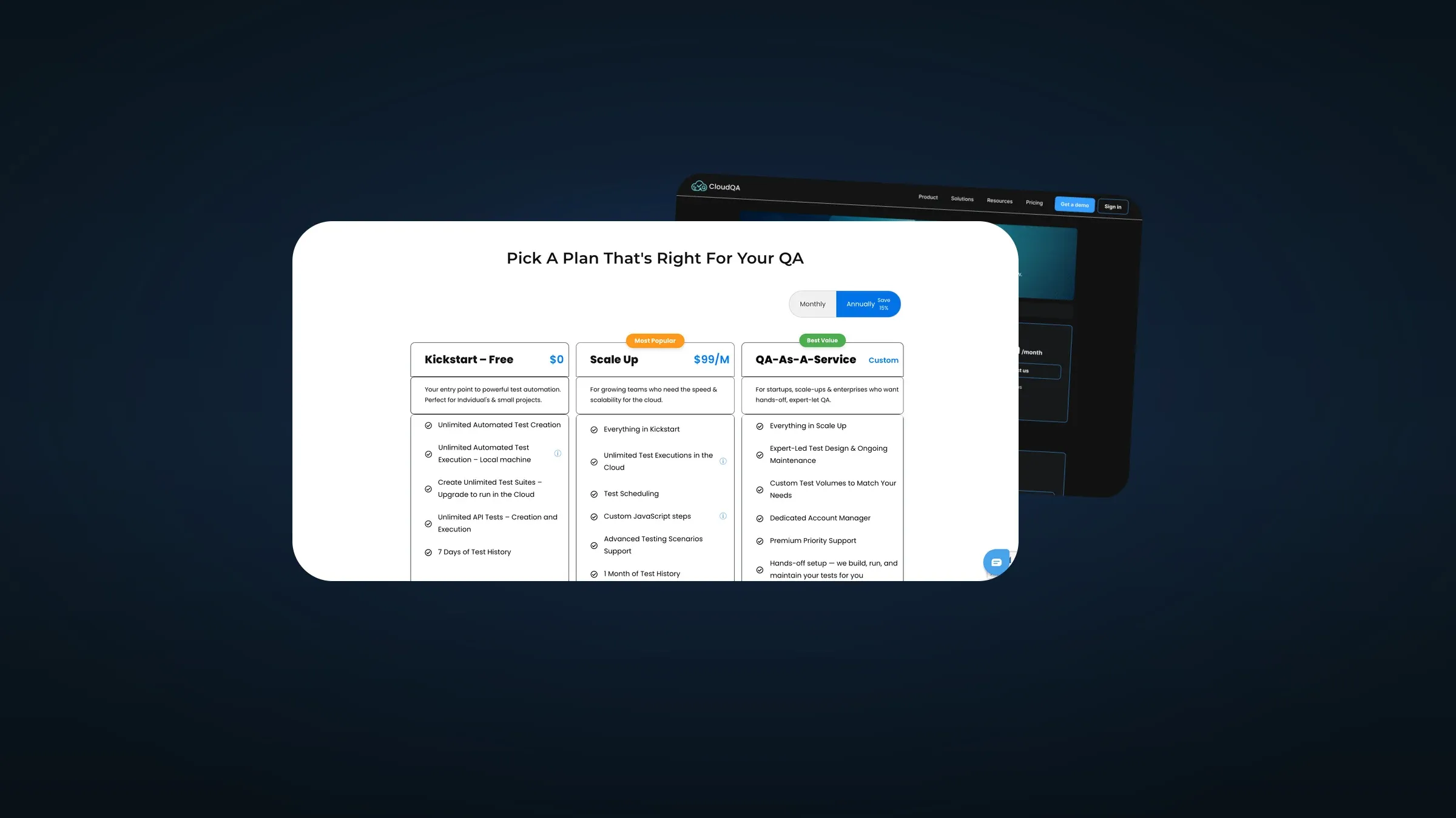
CloudQA sells no-code test automation: software that checks your software still works after you change it. A freelance brief, one page, one job. The pricing page was not converting.
The Actual Problem
The page was a feature grid. Three columns, bullet lists of near-identical length, and no answer to the only question a visitor arrives with: which one of these is me?
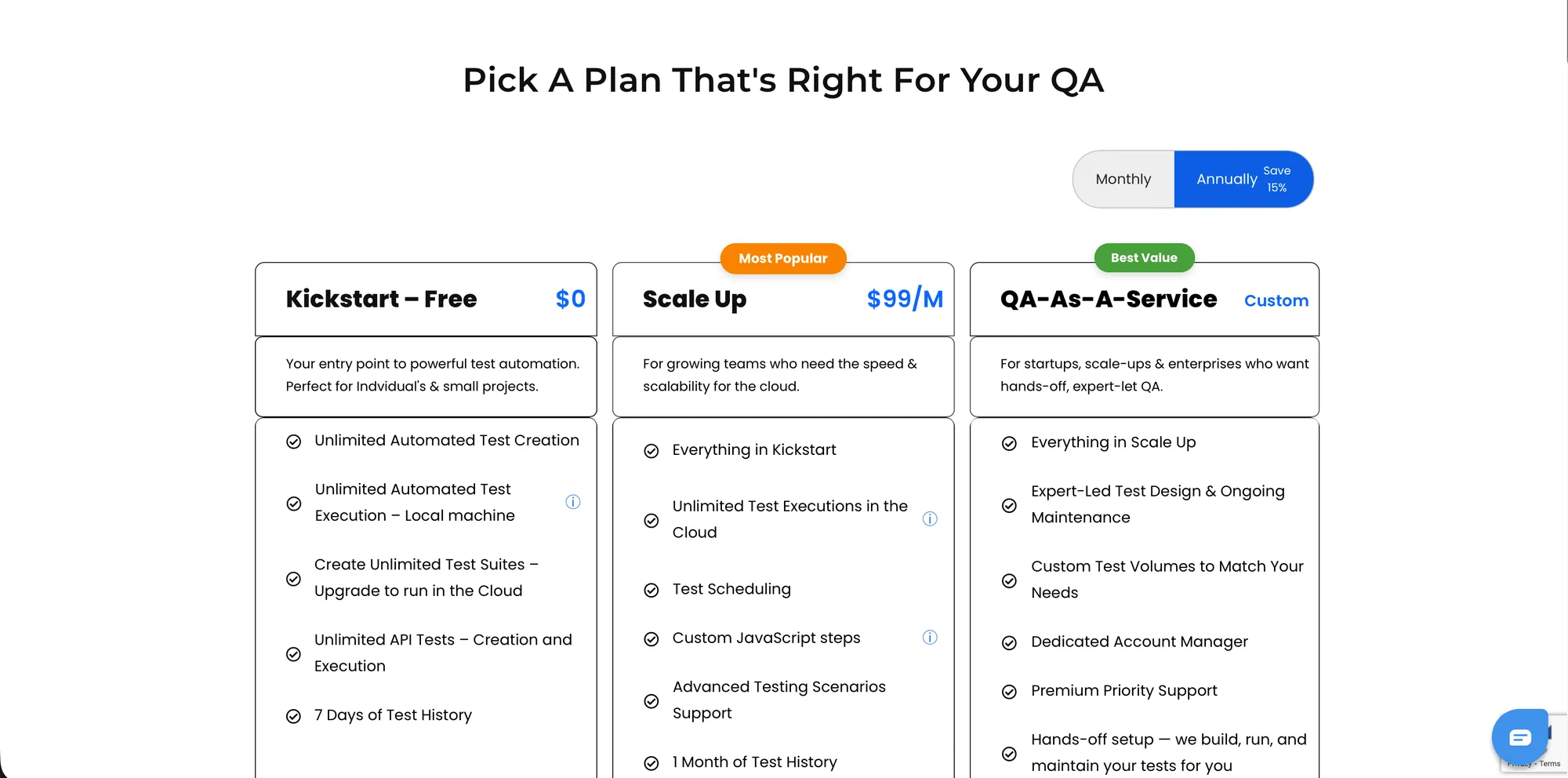
The page as it was. Three columns of similar bullets, and no signal about which plan belongs to which kind of buyer.
A feature comparison is genuinely useful at the end of a decision. It is close to useless at the start of one. Leading with it asks the visitor to do the company’s segmentation work on their behalf, and most people leave rather than do that.
What I Changed
Framed every tier around who it is for before what it contains, so a visitor self-selects in a single read
Gave the recommended plan real visual weight, instead of an identical card with a small badge on it
Put price and the things that drive it up front, with add-on costs stated plainly rather than in footnotes
Pulled the objections forward: what happens after the trial, what counts as a test run, whether you can change plans
Kept the full comparison, demoted below the decision, for the minority who genuinely want to audit it
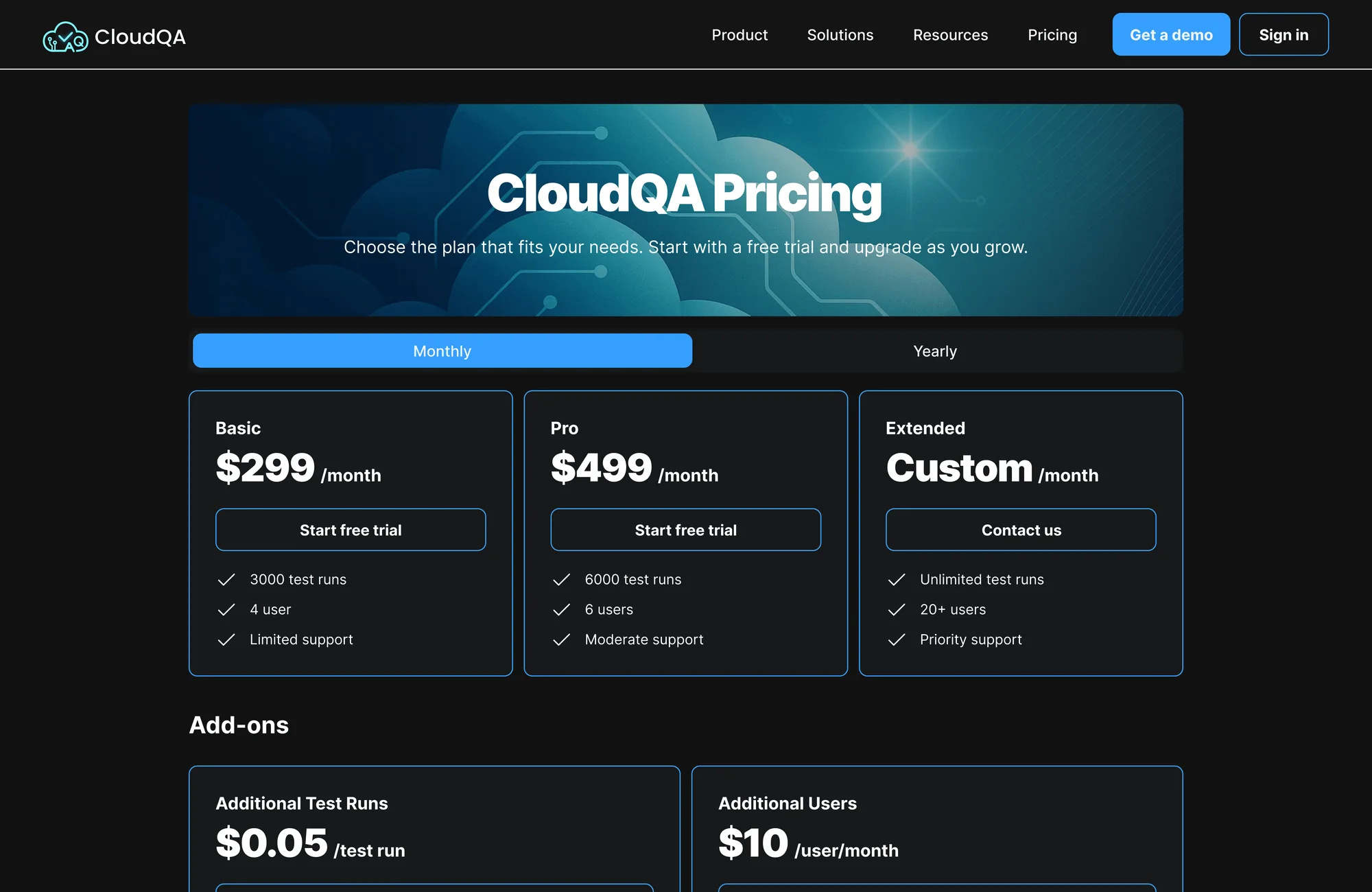
The redesign. Tiers carry a named audience, the recommended plan takes visual priority, and add-on pricing is stated instead of footnoted.
Why Pricing Pages Fail
They fail in a predictable way. The team knows the product so well that every feature feels load-bearing, so everything gets equal space. Meanwhile the visitor knows nothing, needs to be told where they belong, and is handed a spreadsheet.
The redesign does not remove information. It sequences it. Position first, price second, proof third, exhaustive detail last for the small group that wants it.
Moving the FAQ up mattered more than it looks. Those questions are the reason a visitor says "I will come back to this later", and later usually means never. Answering them next to the price removes the reason to leave.
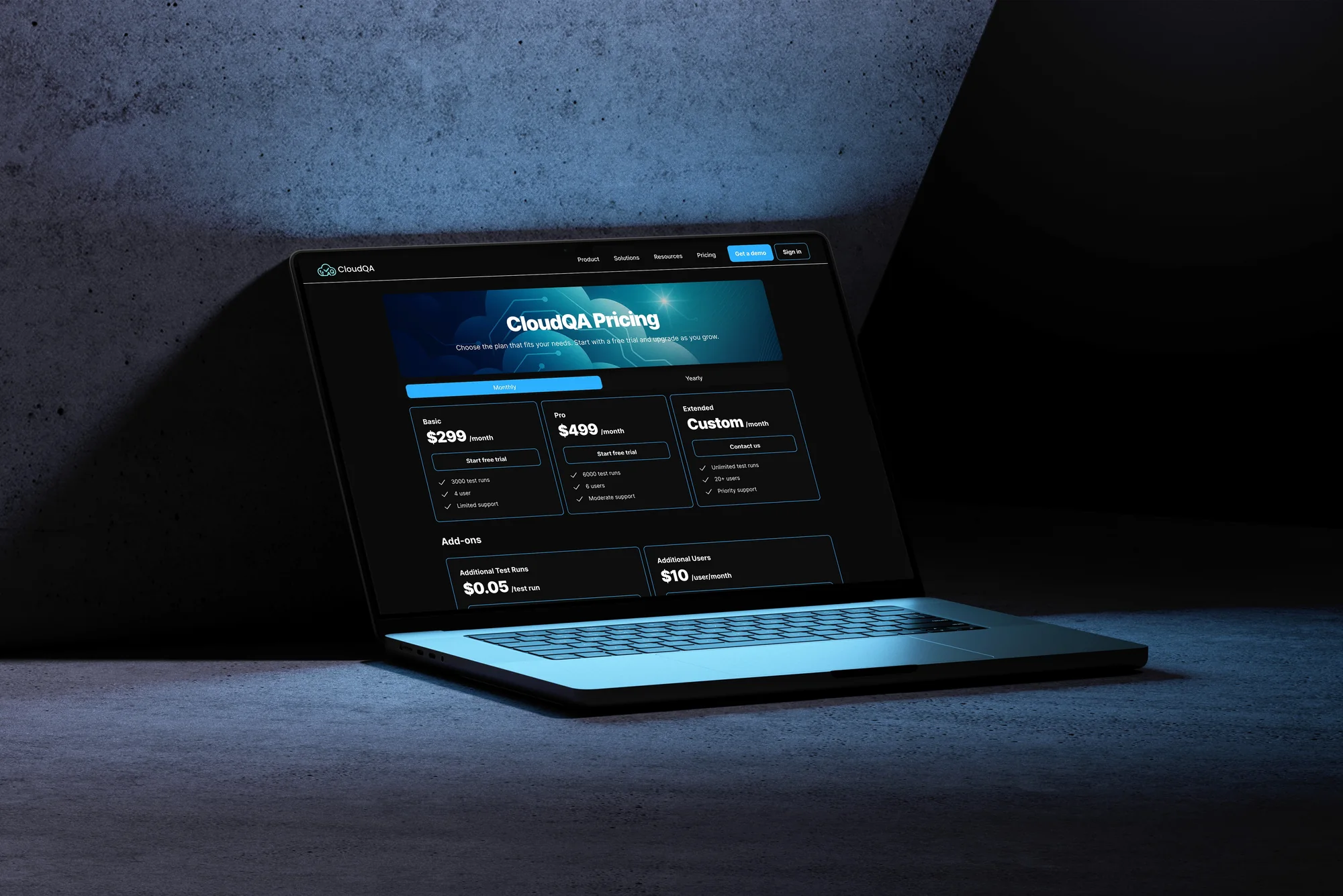
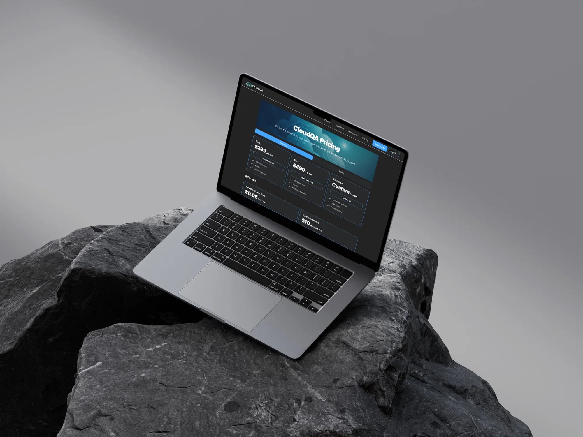
The page in context. Most of these decisions get made on a work machine, mid-afternoon, with three other tabs open.
Scope
This was a focused freelance engagement on the pricing page, not a redesign of the CloudQA product or brand.
I do not have access to their post-launch conversion data, so I am not going to quote a number at you. What I can defend is the reasoning above, which is the part that transfers to the next page anyway.