Every alcohol delivery app in India is a catalogue. Hundreds of bottles, a filter panel, a search bar, and a checkout that quietly adds fees at the last step.
A Brand, Not a Store
Anurag Whiskey Reserve is a self-initiated concept: a single small-batch whiskey label from Mumbai, and the app that sells it. One brand, one cellar, no marketplace.
I wanted to design the opposite of a catalogue. Something for a person who already knows what he drinks and wants it in his hand by evening, not a discovery engine for someone browsing.
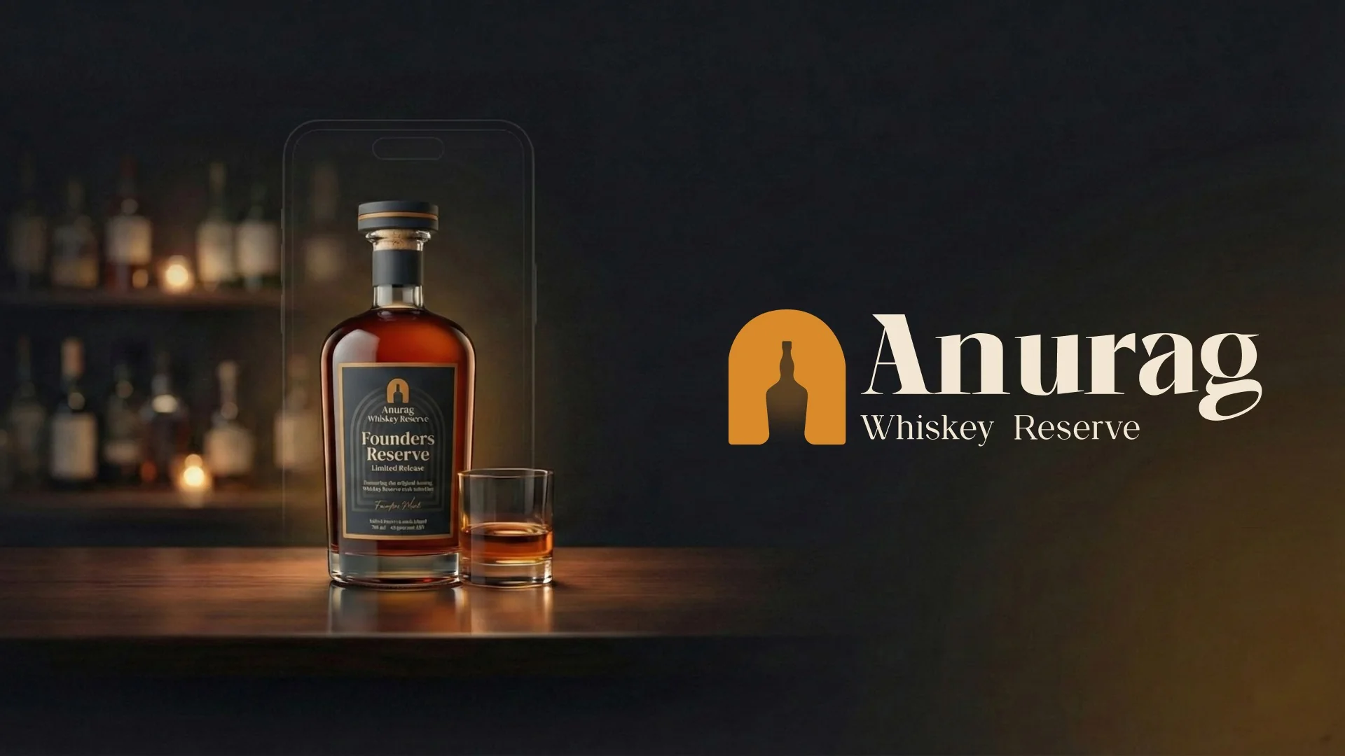
The brand. A single label, positioned as something you keep rather than something you browse.
Sebastian
The whole project is built around one person. Sebastian D’Souza, 42, runs a printing business in Mumbai. Long days, limited time, and he likes ending his evenings with a good small-batch whiskey at home.
His line from the persona work became the brief: "After a ten hour day I do not want to scroll through hundreds of bottles. Just show me the good stuff and get it to my door on time."
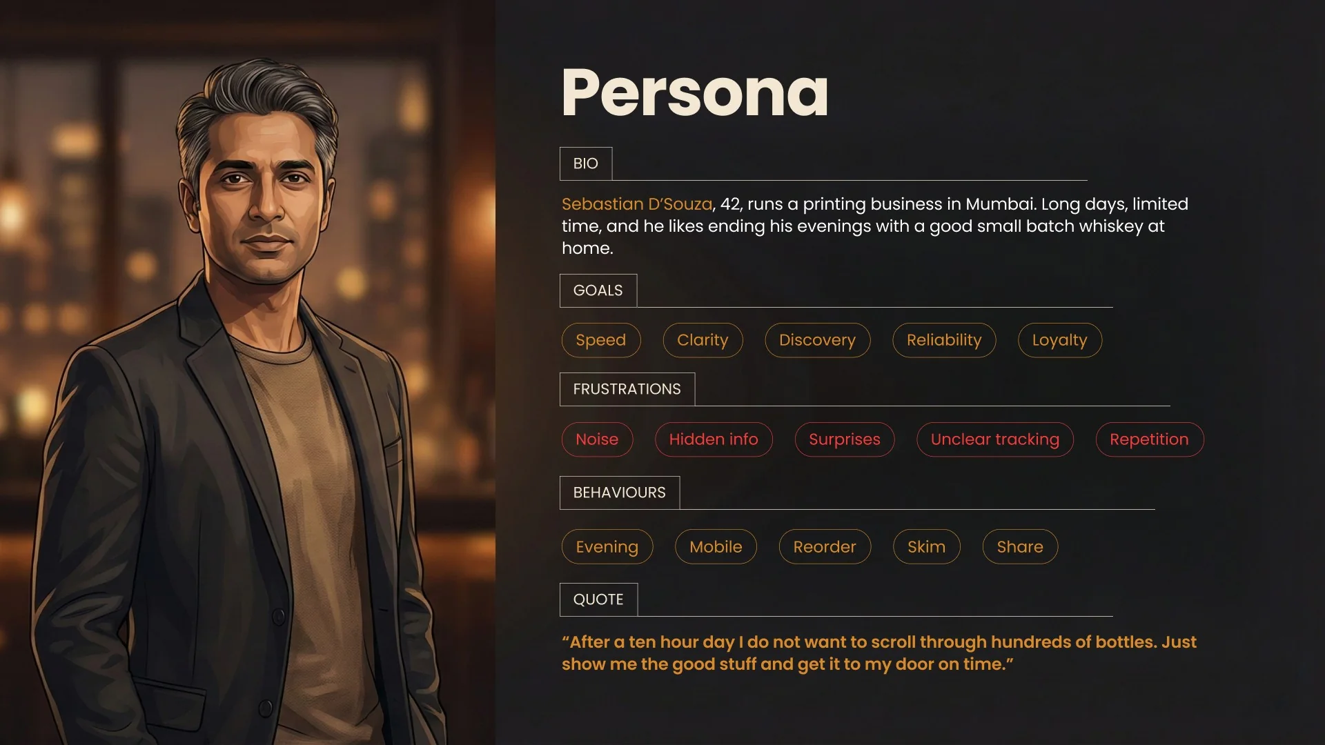
The persona. Narrow on purpose. Designing for one specific evening is more useful than designing for a demographic.
What Was Actually Wrong
I wrote the problems down before drawing a single screen, because "existing apps feel cluttered" is a complaint, not a brief.
Flavour profile, age and ABV hidden behind taps, when those are the only details that decide the purchase
Reordering a familiar bottle repeats the entire address and payment flow, every time
Fees and delivery charges appearing late, which reads as a trick even when it is not one
Order status and delivery-day tracking left vague, so the anxiety lands after the money has gone
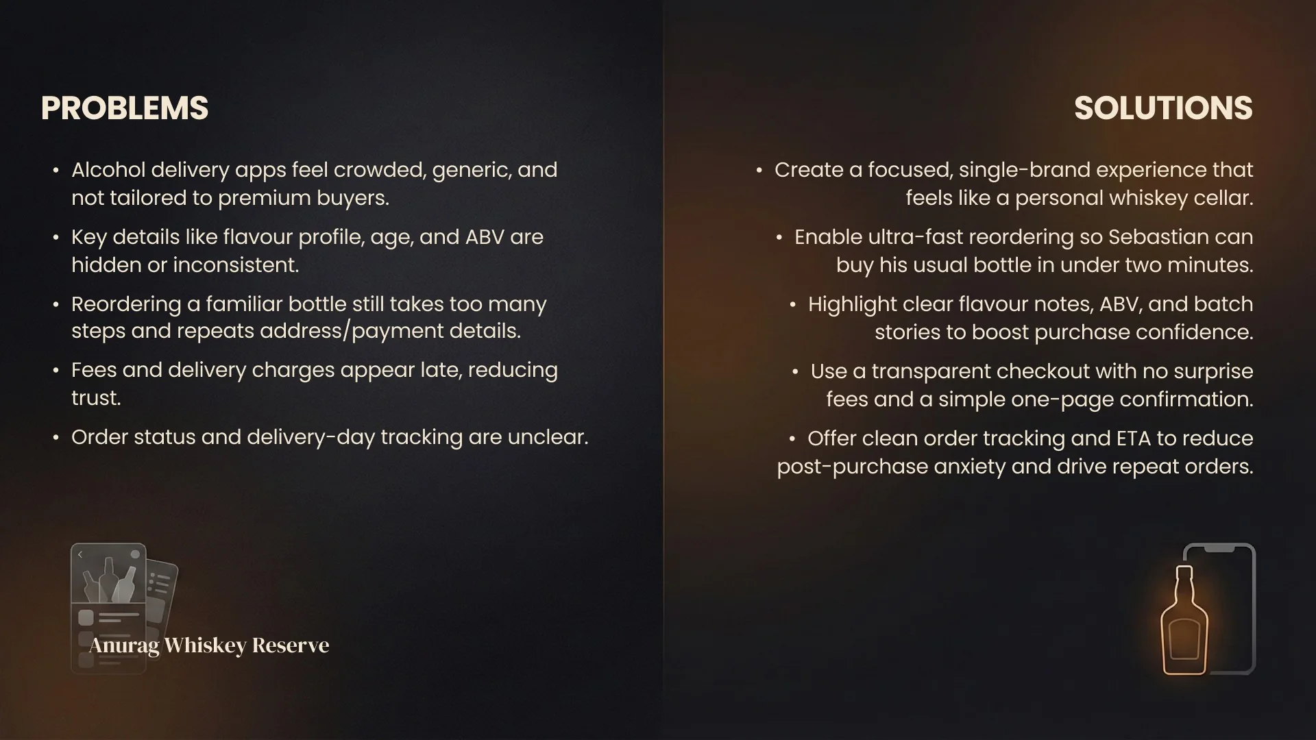
Problems on the left, the decision each one forced on the right. Every screen in the app traces back to a line on this slide.
Seven Screens, One Purchase
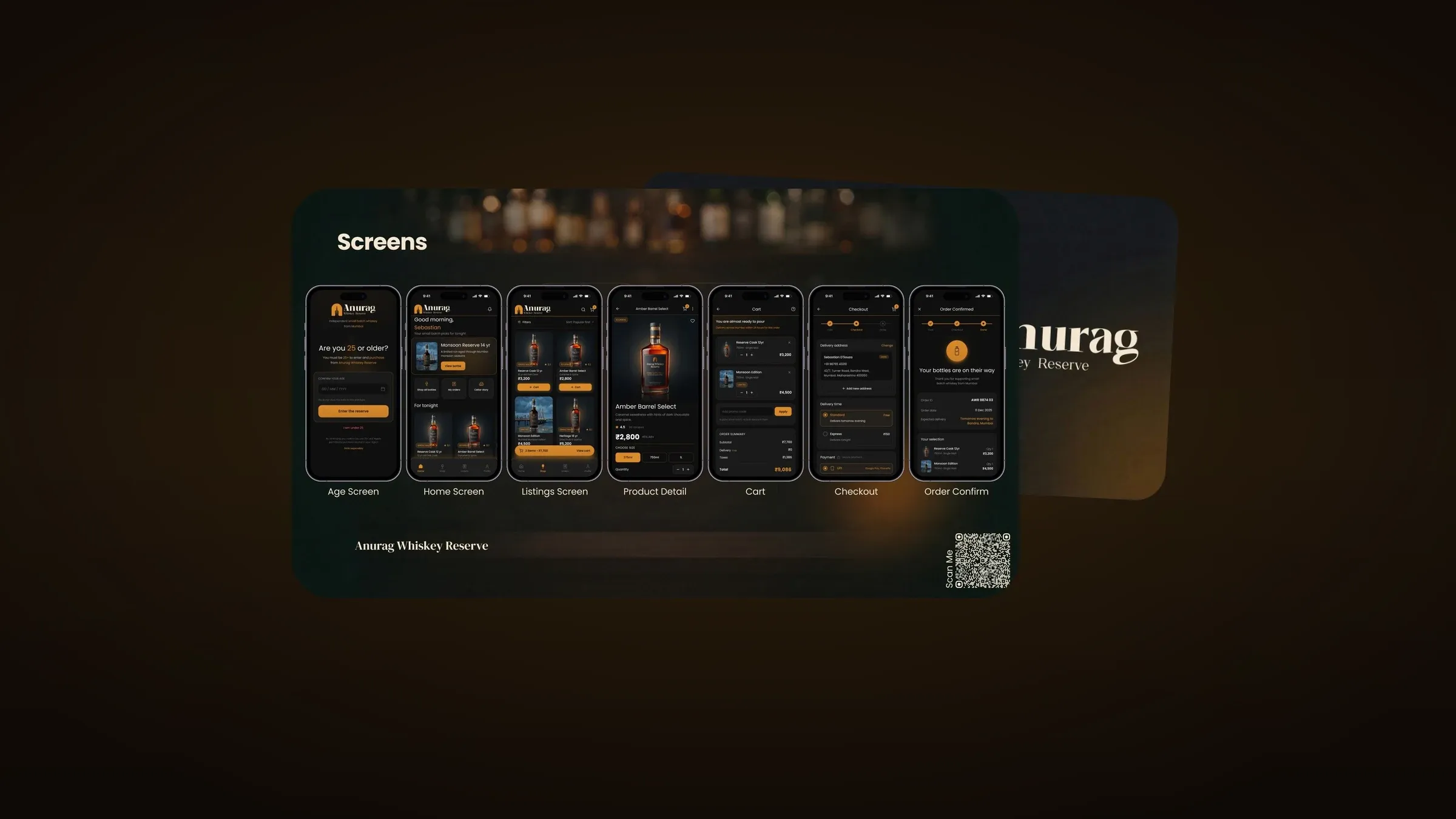
The flow is deliberately short: age gate, home, listings, product detail, cart, checkout, confirmation. Nothing else exists. No feed, no reviews to write, no loyalty points to chase.
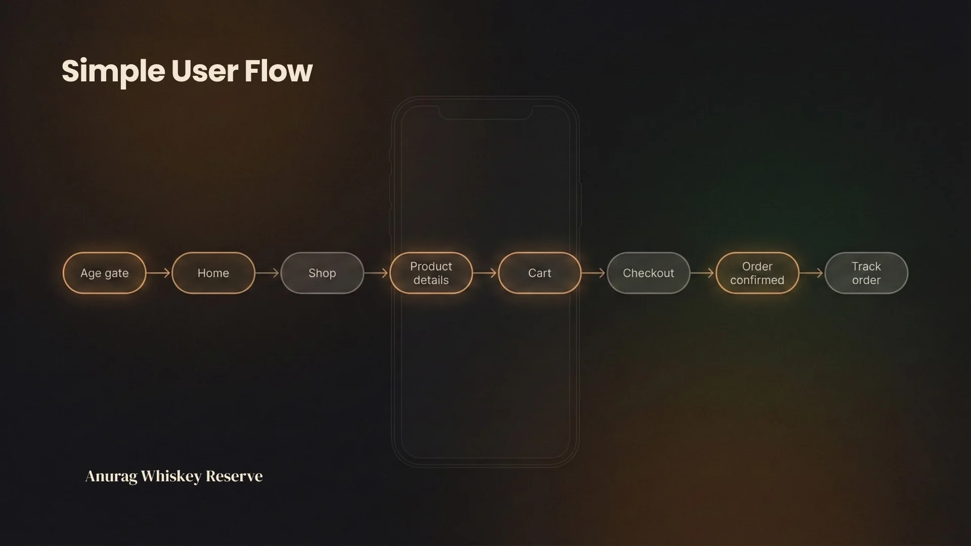
The whole product, in eight steps. Anything that could not be justified on this line did not get designed.
Age verification comes first and does not pretend to be onboarding. The home screen greets Sebastian by name and leads with one curated pick for tonight rather than a grid, because a grid is a decision handed back to the user.
Product detail puts tasting notes, ABV and size selection above the fold, since that is the actual decision. Checkout shows the full total with delivery and taxes before the payment step rather than after it, which is the single change most likely to be felt as respect.
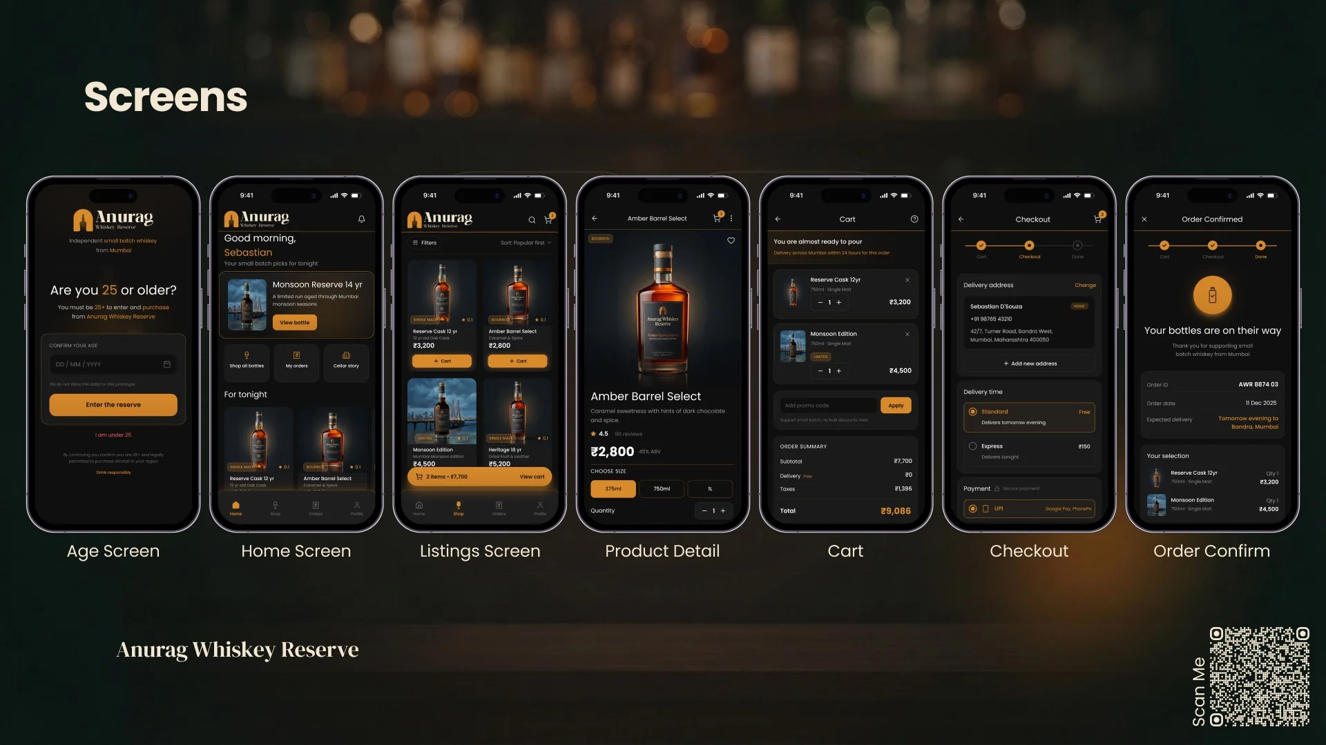
The full set. Dark, warm, amber, and the product photography carrying the page while the interface stays out of its way.
The Look, and One Honest Note
Premium in spirits design means restraint and patience, not gold on everything. So the type is quiet, the spacing is generous, and the amber accent only appears where something is actionable.
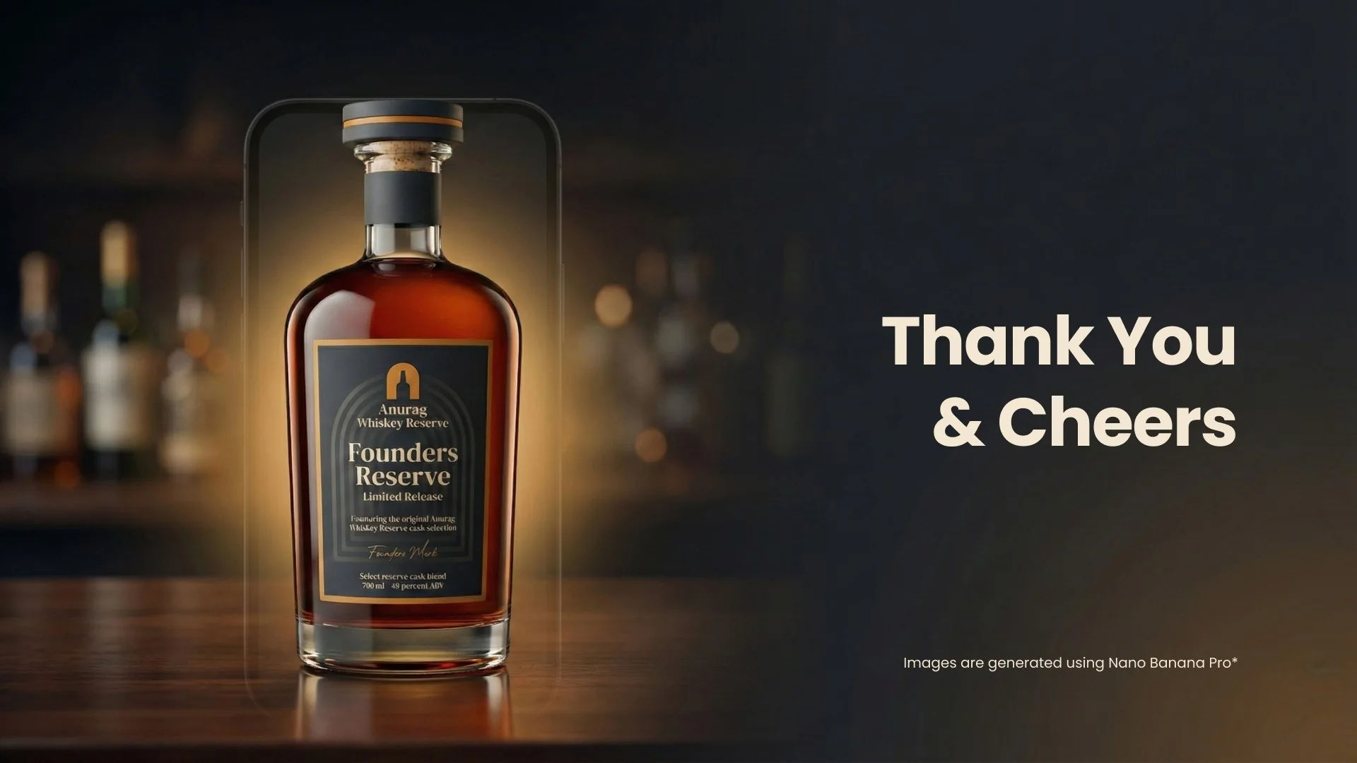
The bottle imagery is AI generated, because the brand does not exist and there is nothing to photograph. The interface, the flow, the brand system and the reasoning are mine.
Where It Stands
A concept project, designed end to end. No client, no product, no sales. It exists because I wanted to find out what customer loyalty looks like as an interface when you are not optimising for browsing.