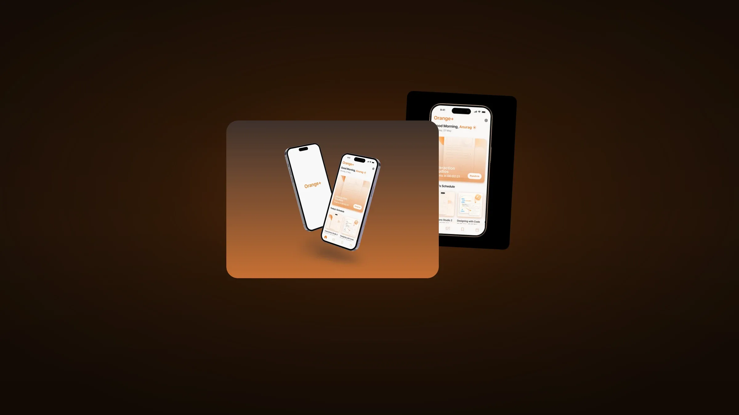
Orange+ is a student app for a design college. One login for the schedule, attendance, assignments and the administrative sprawl currently spread across three portals and a physical notice board.
The App You Open Before You Are Awake
The brief I set myself was narrow on purpose. Not the most complete campus app. The one a student actually opens at 8:55am, walking, one-handed, on the way to a class that starts in two minutes.
Every campus app I looked at was designed for the registrar. Comprehensive, hierarchical, and clearly built by people who sit down at a desk to use software.

The home screen. A live punch-in for the class starting in two minutes, then the rest of the day underneath it.
Designing for an Eight Second Window
Students do not sit down with a campus app. They check it between things, with about eight seconds of attention and one thumb.
So the home screen answers one question before any other: what is happening right now, and what do I have to do about it. The card at the top is the class starting in two minutes, with a Punch In button on it and a countdown running.
Attendance is the single most repeated action in a student’s day. From a cold open, it is one tap. Everything else in the app can afford to be two.
Below that, the day runs as a horizontal strip of cards. Not a calendar grid, because nobody needs a month view to work out where they are going next.
Real Course Names, On Purpose
The schedule cards carry actual titles, Interaction Studios and Designing with Code, rather than placeholder text.
That sounds like a small thing and it is not. An interface designed against "Course 1, Course 2" produces layouts that break the moment real titles arrive, and it hides something true about the user: students identify their day by subject, not by time slot. Design against placeholders and you end up leading with the clock.

Splash and home. The wordmark is the only moment the brand speaks before the day takes over.
Warm, Not Institutional
Orange+ uses a warm gradient, soft illustration and generous type, because of where it actually lives. This icon sits on a home screen between Instagram and Messages, and it has to survive that comparison every time a student unlocks their phone.
Institutional software gets opened because it must be. That is a low bar and it produces low-quality habits. I wanted this one to be opened because it is the fastest way to answer a question the student already has.

The icon in its real competitive context, sitting between Calendar and Mail. This is the comparison the design actually has to win.
Four Tabs, Held
The bottom navigation is four items and stayed four items: home, submissions, saved, calendar.
Every idea for a fifth got refused. The moment a student has to stop and think about which tab a thing lives in, the app has already lost to a WhatsApp group, and once it loses to the group chat it does not get that habit back.
Where It Stands
A product design project taken to a high-fidelity prototype. The screens shown here are the ones I finished. The full flow is not built, and it has never run against a real timetable.