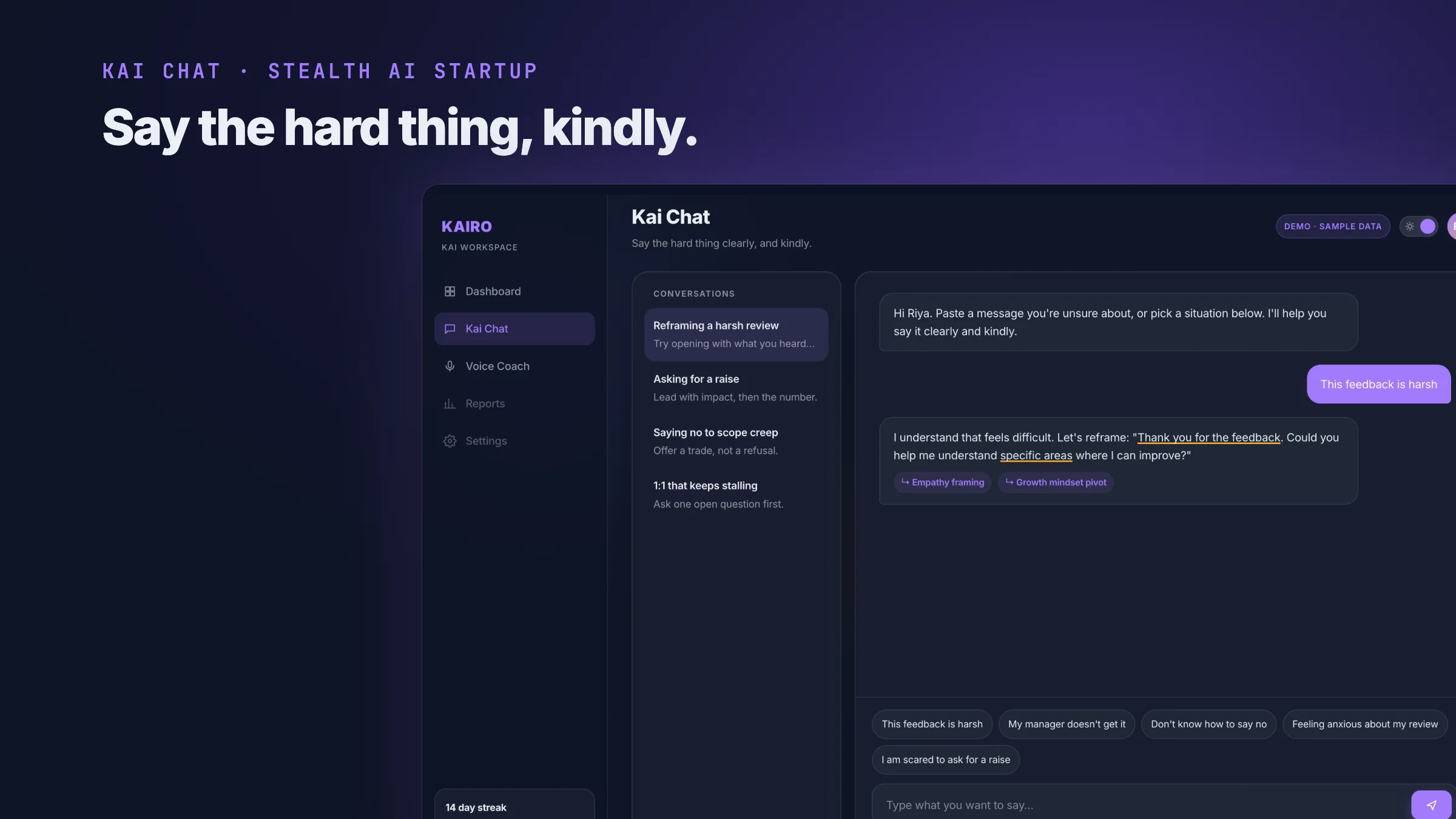
Kai Chat is where an employee brings the thing they cannot say out loud. A manager taking credit for their work. A review they are dreading. A resignation they have not decided on yet.
A note on names: the AI startup I designed this for is still in stealth, so it appears here as Kairo, its products as Kai, and every screen is my own 2026 rebuild with sample data. The live version is one click away.
Not a Chat Window With a Logo On It
That context changes the design problem completely. A general purpose chat interface is optimised for getting an answer quickly. This one has to be optimised for getting someone to start typing at all.
The person on the other side is about to describe a workplace problem, in writing, to software their employer paid for. Every ordinary chat convention has to be re-examined against that.
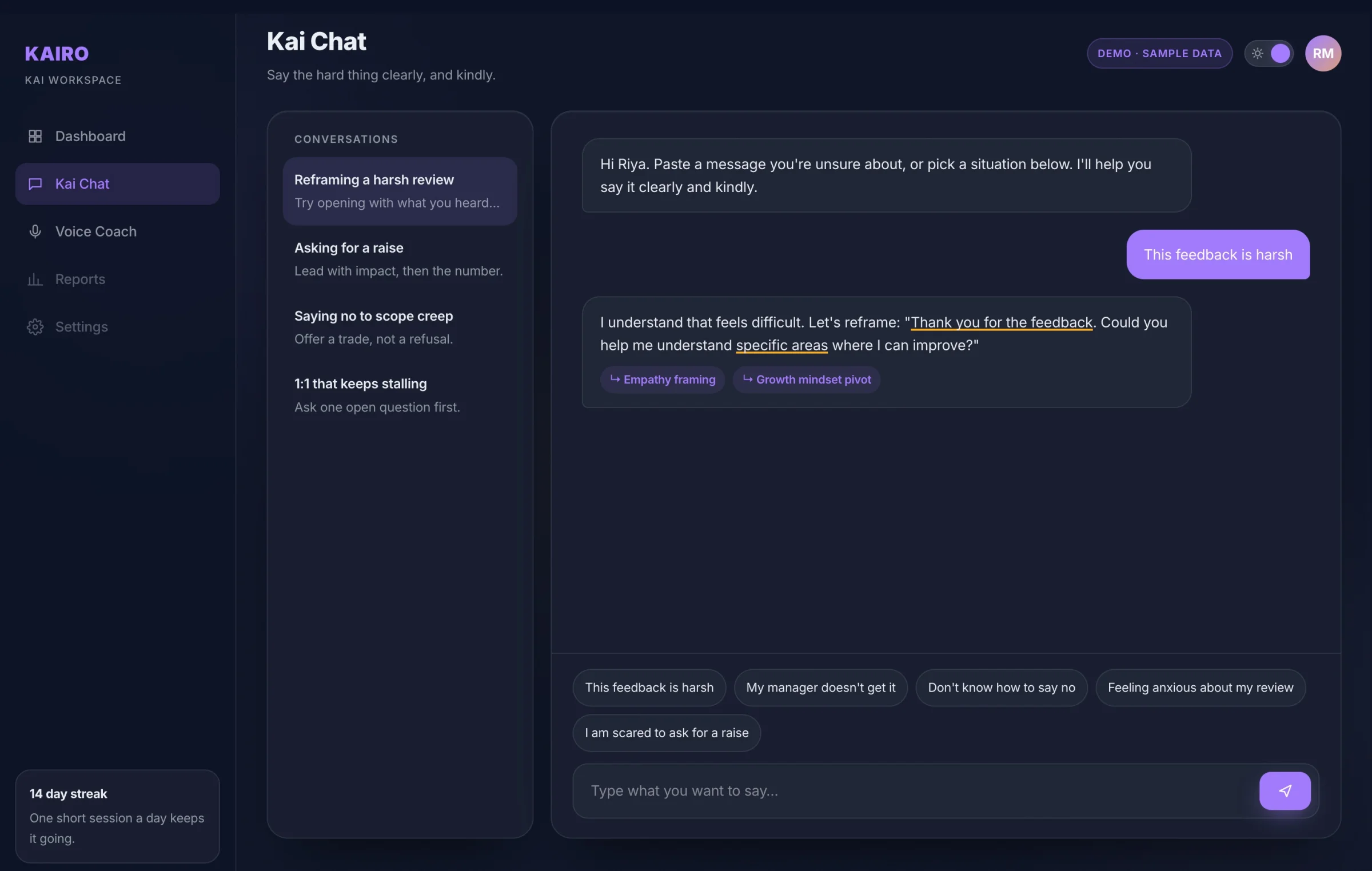
A reply in the 2026 rebuild. Kai rewrites the message, underlines the phrases doing the work, and names why each one helps.
The Blank Page Problem
The hardest screen in the product is the one before the conversation starts. A cursor blinking in an empty box asks the user to summarise their own workplace problem in a sentence, cold. Most people close the tab.
So the empty state offers ways in instead, phrased the way a person would actually say them out loud: this feedback is harsh, my manager doesn't get it, I don't know how to say no.
Picking one is a much smaller act than composing an opening line. It also quietly teaches the user what the product is for, which a placeholder saying "Ask me anything" never does.
Showing the Reasoning
A rewritten sentence on its own teaches nothing. So every reply underlines the phrases that carry it and labels them, empathy framing, growth mindset pivot, so the person learns the move and not just the line.
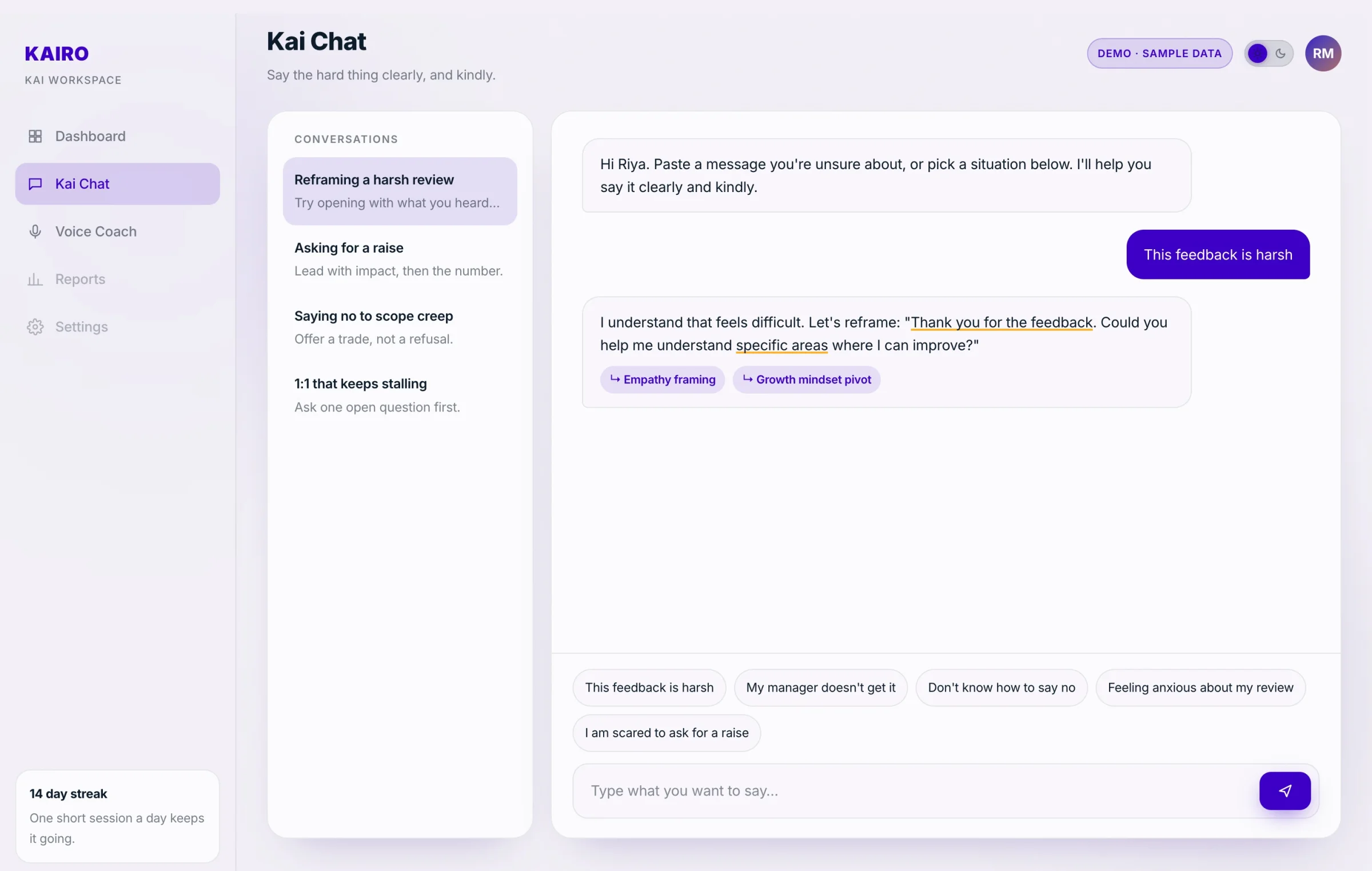
Light theme. Conversations on the left, the prompts people actually start with above the input.
Consent Before Anything
The product works better if it remembers your history. That is also precisely the thing an employee should be nervous about.
So consent is a full screen, shown before the first message, written in sentences rather than policy language. It says what is stored, what it is used for, and how to clear it. The user can decline and still use the product.
In a tool where the employer is the customer and the employee is the user, being visibly straight about data is the entire basis on which anyone types anything honest into it.
The Voice Sibling
Kai Voice Coach handles the same conversations out loud, for people rehearsing a real exchange rather than drafting one. Speaking a difficult sentence and typing it are different skills, and the second does not prepare you for the first.
Its microphone request follows the same rule as the chat consent screen. The compliance details, the deletion window and a genuine text only option are visible at the moment of the ask. A permission prompt with no context gets denied, and a denied microphone in a voice product is a dead end.
What I Owned
The conversational flow: entry states, suggestion design, and how a coaching exchange is structured differently on screen from ordinary chat
The consent experience across both the chat and voice products
Empty, loading and permission declined states, because those are the ones real users actually hit
Design consultancy work for the startup's team, built on the system established by the landing page and dashboard. The live demo is my 2026 rebuild with scripted sample replies.